Nook Café
my first venture into visual design
Background
For this project, I am focusing on brand identity and print design. I am interested in developing my skills in branding and learn the process of creating mockups. I want to infuse the things I love doing into my creation, such as reading a good book while enjoying a cup of coffee. To enhance my skills, I challenged myself by exploring new tools, such as Procreate, and discovering different ways to use my current tools to create diverse designs.
Project Brief
client
No client involved, as this is for the brand identity design of a fictional cafe
role
Planning & designing
tools
Procreate & Figma
timeline
5 days
Mood Board
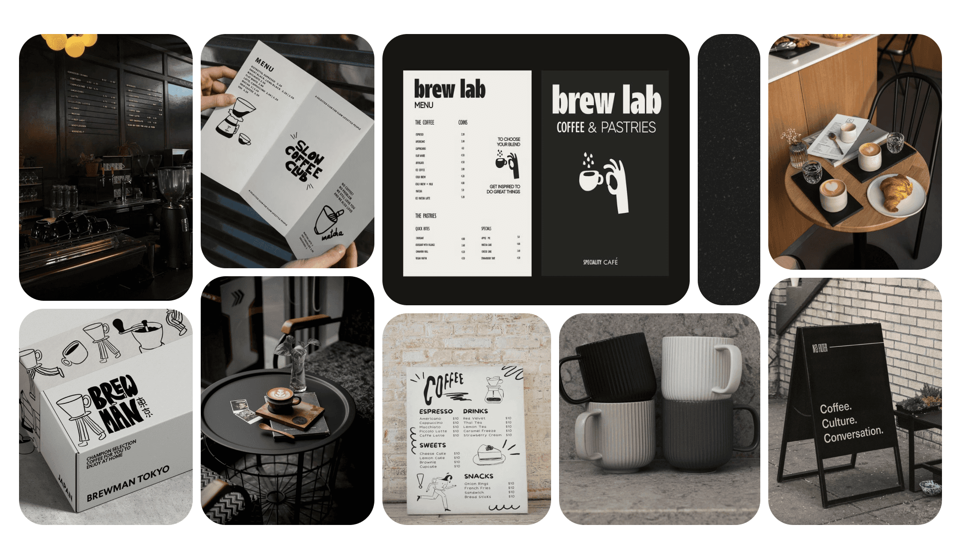
My aim is to create a design that reflects modernity, minimalism, calmness, and focus as the target audience includes students, freelancers, and remote workers who frequently seek out cafes to study or work, as well as those who just want to grab a coffee and chat. Through Pinterest, I managed to create this mood board which captures the aesthetics envisioned for the cafe identity design.
Colour Palette
Based on the mood board created to inspire the identity design of Nook Café, I explored colour options to match the desired aesthetic. A minimalistic colour combination was considered, and the final palette was narrowed down to four colours. These evoke a sense of modernity, minimalism, calmness, and focus, in line with the intended design.

Typography
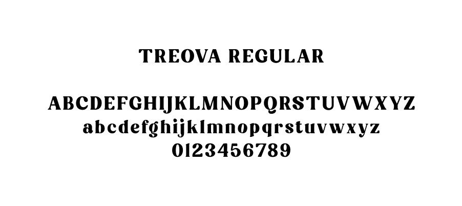
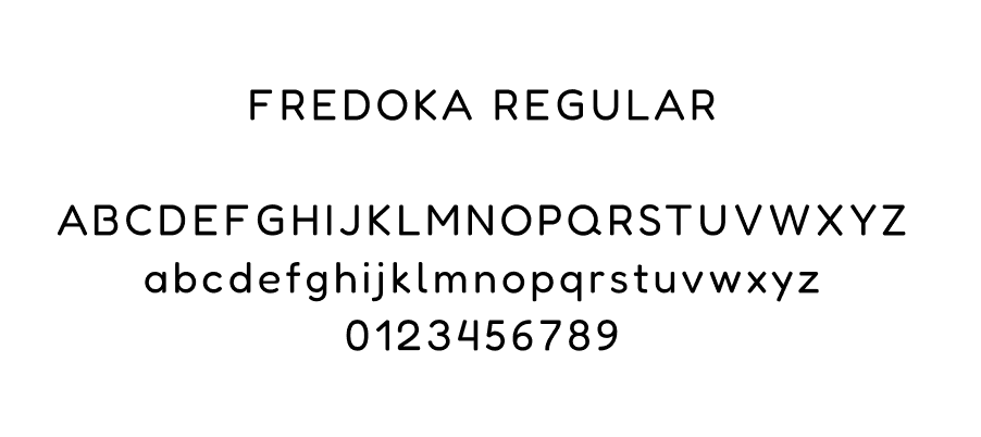
For the typography, I chose a basic typeface that combines elements of elegance, classic, and retro. To achieve that, Treova and Fredoka were used for the contents of the designs created for the cafe's identity.
Logo Design & Illustrations
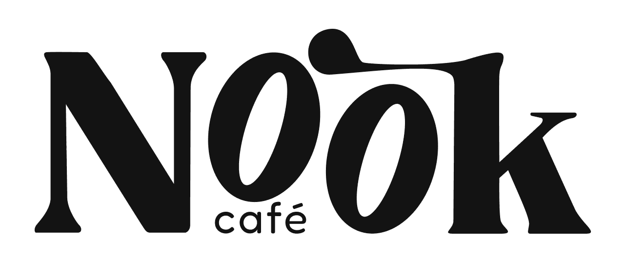
I began the logo design for the cafe with the overall ambience in mind. The combination of the colour palette and typography guided me to create a logo primarily in Rich Black, influenced by the Treova typeface. Using Procreate, I illustrated the logo sketch, capturing the intended sense of both elegance and retro aesthetics as outlined in the mood board.

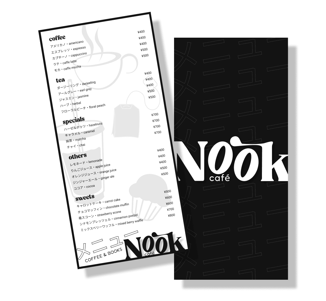
In addition to the logo, I also sketched and finalised the illustrations for the menu design using Procreate. I created several illustrations based on the menu selections for the cafe, ultimately choosing four, with the illustration of a cup of coffee as the centrepiece.

Visual Branding
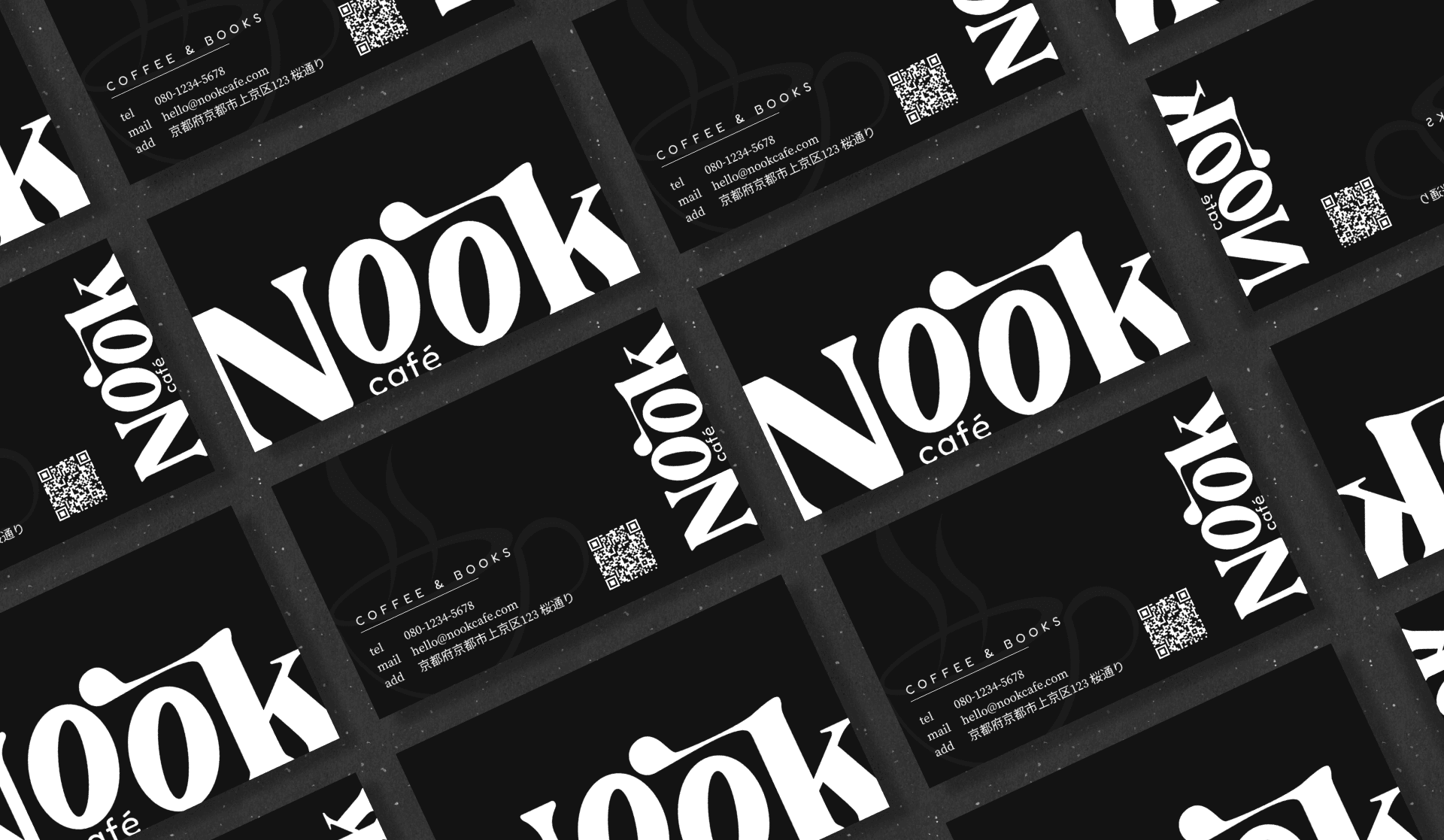
business card
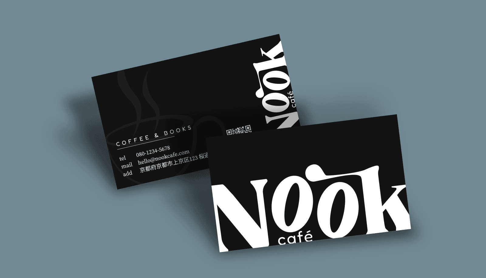
For the business card, I aim to create a professional design with a vintage retro style that is aligned with the cafe’s identity. To achieve this, I chose Rich Black as the primary base colour, with White for the logo and the information on the back of the card. To incorporate the illustrations created for the menu, I used the main illustration, a cup of coffee, as the back design of the business card. To harmonise the content, I selected Charcoal Grey for the illustration, blending it seamlessly with the white-coloured logo and the dark base colour.
loyalty card
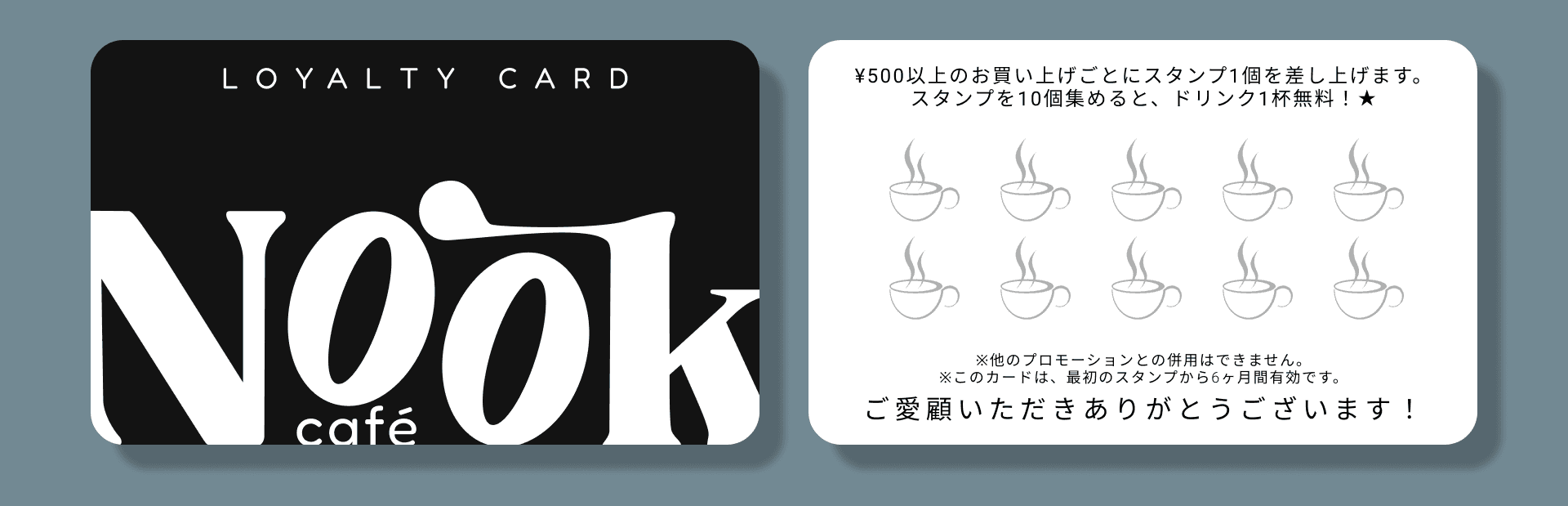
Cafes often attract regular customers who stop by for a quick coffee. To encourage continued patronage and express appreciation, loyalty cards are commonly used to offer discounts or coupons by collecting points. For Nook Café, I designed a loyalty card to help invite more customers. The front of the card mirrors the business card design, with the addition of ‘Loyalty Card’ written at the top and rounded corners for a sleek look. On the back, instructions on how to collect points are presented using the Fredoka typeface on a white-coloured base. To add a little creativity, I used the coffee cup illustration as placeholders for the points.
menu
When it comes to cafes, the first thing that comes to mind is, of course, the coffee. Personally, I always think about the variety of coffees to choose from. To reflect this, I designed a menu that displays a wide selection of coffees and other options in a user-friendly layout. Initially, I considered an A4 size for the menu, but after some thought, I opted for a slightly narrower design to present the selections more compactly. I used White as the base colour, with Rich Black borders to make the content stand out. The typeface Treova was used for the food and drink categories, while Fredoka was chosen for the item names and prices. To highlight the cafe’s branding, I placed the logo at the bottom of the menu and also featured it prominently on the back, set against a Rich Black background to match Nook Café's primary colour scheme.
Reflections
When I first started this project, I had doubts about whether I could successfully design the brand identity of a cafe. It was a journey filled with self-doubt and confusion. However, by the end of it, I gained valuable knowledge and skills through my exploration in visual design.
looking back
It was a valuable learning experience, and I learned how to use Procreate effectively to create the logo and illustrations I envisioned. The design process took just five days, which was shorter than my previous UI/UX project, but the experience was undoubtedly fun and insightful.
looking forward
I’m eager to explore more in visual design, experimenting different methods, concepts, and styles. Expanding my knowledge and skills in visual design, in addition to UI/UX, will be highly beneficial. It will also allow me to incorporate these skills into my UI/UX projects, enhancing the overall design process.