Bella's Portfolio
building my brand: the story behind my portfolio design
Background
From a blank canvas to a digital showcase, this portfolio reflects my journey as a UI/UX designer, balancing aesthetics with usability. It all started with a question: How can I create a portfolio that feels like me? I wanted something that didn’t just list my skills but told a story about who I am as a designer. This portfolio project became a journey—one that stretched from sketching my first ideas to carefully crafting every interactive element. As I dove into the design, I focused on creating a space that’s both professional and inviting, a place where anyone could easily navigate and explore my work. My goal was simple: to create an online space that feels authentic, professional, and uniquely me by making sure that my personality shines through while keeping the user experience smooth and engaging. Through each phase, from brainstorming concepts to building functional prototypes, I worked to bring balance between usability and visual appeal. This case study shares that journey, highlighting the ups, downs, and little decisions that shaped the final result.
The Challenges
Armed with just four months of design knowledge, I poured everything I’d learned into creating this portfolio. I didn’t see my limited experience as a weakness; instead, it was a challenge that fuelled my determination to make each design choice count, even with limited resources. Another hurdle was managing my time: I wanted to finish this project on a strict timeline to test my ability to deliver under pressure. Through every obstacle, this portfolio became a testament to my growth as a designer; pushing me to find creative solutions, embrace constraints, and turn what I knew into something meaningful.
The Goals
The main goal for this project was to create a portfolio that truly felt like me, a space that reflects my personality and style while showcasing my skills. I wanted this platform to be more than just a showcase; it’s also a way to track my growth as both a designer and developer. Being my third project, it’s a milestone, showing how far I’ve come since I first started self-learning UI/UX design. Every piece of this portfolio holds a bit of my story, marking my progress and the lessons I’ve learned along the way.
Research
To kickstart the design process, I conducted research focused on understanding both my target audience and my own needs, analysing market trends, and exploring portfolios from other reputable designers. Being part of the target audience myself gave me a unique perspective and helped me empathise with the challenges my users face. This research provided valuable insights into effective strategies for similar projects and revealed what resonates with my target audience. By the end of this step, I had gathered key information about my audience, along with a summary of user personas, pain points, and potential solutions, all of which guided my design decisions.
Target audience
The primary audience for my portfolio includes hiring managers, recruiters, and fellow designers interested in my design approach and skills. Additionally, it’s open to anyone curious about my work, including myself, as this portfolio serves as a personal playground for design experimentation.
market trends
During this process, I also researched market trends in design portfolios, looking at examples from fresh graduates, junior designers, and aspiring designers (like myself). This research highlighted popular trends in layouts, colour & typography, interactive elements, and navigational structures to gain a comprehensive understanding of current best practices.
As I look through the portfolios of various designers, I found myself exploring an array of layout styles, each with its unique way of showcasing work. It became clear that minimalist layouts are a favourite in today’s design world. Many designers choose to go with clean lines and ample white space that make their projects shine, often through wide margins, generous padding, and large images with minimal text. The effect? A spacious, visually appealing feel that allows each piece of work to shine. I came across portfolios that might feature a single, bold project image or a striking title with just a hint of description, creating an effortlessly modern look.
But minimalism isn’t the only star here. I also noticed the bold presence of brutalist designs, which seem to be a favourite among those who want their portfolio to stand out from the crowd. This style, with its raw, unpolished feel, really lets designers show off their personality and go against the grain. A great example of this can be seen when I stumbled across Josie Allison's portfolio with it's unique and fun designs. And while some portfolios lean on a single layout style, others blend different approaches with each section serving a unique purpose or enhancing the overall experience for visitors.
Another trend that caught my eye was the move toward dark colour palettes. Many designers are embracing dark mode for its sleek, modern feel and its eye-friendly contrast. Typography plays a big role in these portfolios too, with most favouring minimalist typefaces, often sticking to just one or two fonts, usually sans-serif. The emphasis on ample spacing, bold headlines, and smaller body text creates a smooth reading flow that’s easy on the eyes. I particularly enjoyed scrolling through the portfolio of Figma product designer Billy Sweeney, who used a black-and-white palette to achieve a strikingly elegant, minimalist aesthetic.
There’s also been a shift towards more interactive elements, as designers look for ways to make their portfolios engaging and dynamic. Kevin Hilgendorf’s portfolio, for instance, came alive with animated transitions between sections, while Marco Deluca’s used subtle hover effects that provided interactive feedback. These little touches added a level of engagement I found both refreshing and memorable. Inspired by their approach, I began thinking of ways to incorporate similar elements to make my own portfolio feel interactive and inviting.
Interestingly, I noticed that single-page websites with scroll-based navigation are quite popular as well, especially among senior and professional designers. This layout allows them to showcase everything on one page, guiding viewers seamlessly from section to section. The bento-style layout, too, seems to be a favourite as it organises content into tiles, giving visitors an easy, at-a-glance view of different sections.
user personas
Hiring Manager at a Design Agency
Sophie leads a team at a mid-sized design agency and is responsible for reviewing portfolios to find fresh talent. She often skims through portfolios to quickly understand a designer’s skills, personality, and problem-solving approach in a visually engaging way.
Goals : To find a candidate whose aesthetic and approach align with her agency's values and personality; to evaluate the candidate’s creativity, skills, and approach in a short amount of time.
Challenges : Limited time to review each portfolio, so she needs a clear, easy-to-navigate layout; wants to get a feel for both technical skills and personality in the portfolio to see if they’re a good cultural fit.
Looking For : A direct, easy-to-scan layout that allows her to understand skills and thought process at a glance; case studies that tell a story, revealing problem-solving skills and design decision rationale.
UI/UX Recruiter
Albert works for a tech company specialising in UX-driven apps. He reviews portfolios daily and needs to quickly identify candidates with a strong foundation in UI/UX principles.
Goals : To understand your design thinking, user-centered approach, and technical UI/UX skills; to assess your knowledge of modern UI/UX trends and your ability to adapt to various project requirements.
Challenges : Reviews multiple portfolios daily, so he needs a concise yet comprehensive portfolio; requires portfolios that highlight real-world applications of design skills.
Looking For : Case studies that clearly show your design process, from user research to wireframes and final designs; a mix of user-friendly layout and interactive elements that demonstrate your UI/UX skills.
Startup Founder
Noelle is the founder of a small tech startup and has a basic understanding of design. She’s looking for a designer who can bring creative ideas to her business’s brand while also having knowledge in web development.
Goals : To find a designer with practical, problem-solving skills and a creative eye; to see if the designer has diverse skill set that enables them to see projects from multiple perspectives.
Challenges : Limited design knowledge, so she needs a portfolio that is straightforward and non-technical; prefers to see results and final visuals over detailed process descriptions.
Looking For : A portfolio that visually communicates your skills without heavy design jargon; case studies with clear outcomes and visuals that convey your creative strengths and project impact.
Fellow Designer
Julius is a recent design graduate starting his career. He frequently browses other designers’ portfolios to learn more about layout ideas, style trends, and storytelling techniques in case studies.
Goals : To find inspiration in design layouts, interactive elements, and portfolio storytelling; to understand how an amateur designer approaches and presents their case studies.
Challenges : Often gets overwhelmed by overly complex portfolios, so he values simplicity and a clean design; needs clear breakdowns in case studies to understand each project’s background and design decisions.
Looking For : A mix of inspiration and practical, easy-to-replicate design solutions; insightful case studies that demonstrate a thoughtful approach to design problems.
research insights & design choices
After exploring the portfolios of several talented designers, I gained valuable insights that helped me make decisions about the direction I want for my own portfolio. Considering my current skill level and design knowledge, I aim to create a portfolio that not only aligns with market trends but also reflects my personality and approach to design. I believe a minimalist design, thoughtfully combined with diverse elements, will help me convey the vision I have for my work.
Layout style & Navigational Structures
I started my portfolio journey by thinking about the layout style that would best represent my work and give my case studies the spotlight they deserve. As I sifted through ideas, I found myself drawn to minimalist style. There was something about the simplicity, clean lines, ample white space, that felt like the perfect frame for my projects. Plus, it gave my portfolio the modern, uncluttered feel I envisioned and room for future changes as I continue to grow my skills and experience in UI/UX design.
When it came to structuring the content, I wanted visitors to be able to navigate freely without feeling overwhelmed. That led me to the idea of separate pages for each section, which felt natural for guiding people smoothly from one project to another. Initially, I considered a bento-style layout for the landing page; a design I’d seen that presented information in neat, clickable tiles. But as I started piecing it together, I realised it didn’t quite fit with the clean, minimalist aesthetic I was building. So, I set it aside in favour of a simpler, more direct approach that felt true to the vision I had for my portfolio.
Colour Palette & Typography
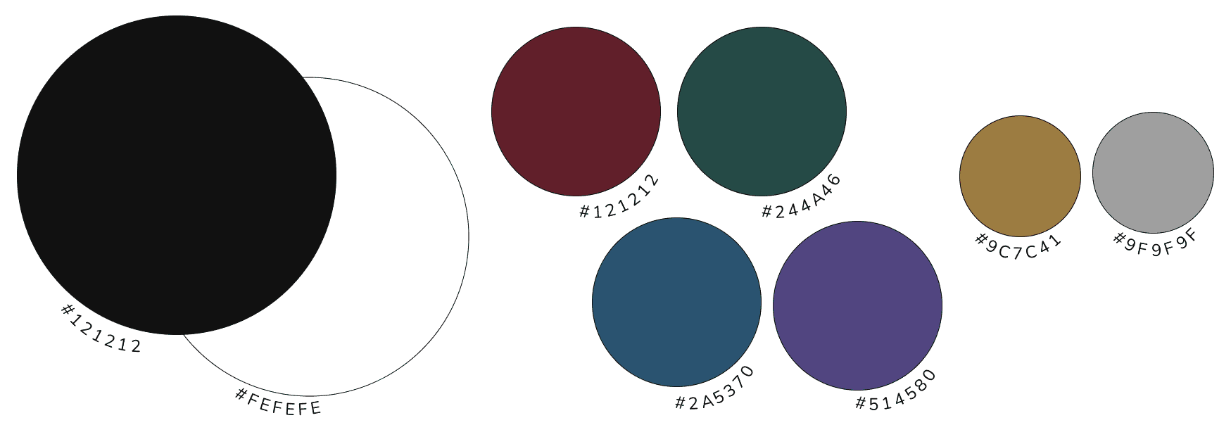
While choosing a colour palette, I found myself torn between dark mode and light mode. Both had their appeal, each bringing a different vibe to the minimalist concept I was working toward. After a lot of back-and-forth trials, I finally decided to use both, light mode on some pages, dark mode on others, giving each section its own distinct feel while keeping the overall design cohesive.
This choice also sparked the idea of experimenting with bold, oversized titles and headlines, a popular trend I’d noticed in other portfolios. It felt like a way to add extra emphasis to my work and bring a bit of visual drama to the clean, minimalist look I wanted. This combination of bold typography and contrasting colour modes seemed like the perfect way to create a balanced, impactful design that stayed true to my vision.
Portfolio Pages & Sections
Landing page : This is the main page visitors will see when they arrive at my portfolio. From here, they can easily navigate to other pages and sections.
Work section : This section will showcase all my projects, including current work and future additions. Each project will have a link to view its detailed case study.
About page : This page speaks for itself, I would like to have a space for visitors to learn more about me, my personality, and my character. This page will offer a glimpse into who I am beyond my work.
Background page : Here, I’ll display my academic background, work history, and design values, giving visitors insight into my professional journey.
Contact page : A dedicated page where visitors can reach out to me via email or LinkedIn.
Although each page has distinct content, I plan to keep the main navigation menu at the top of every screen for easy access. Additionally, the footer on all pages will include my email address and a copyright notice.
Ideation & Initial Designs
When I first started this project, I had several ideas in mind that I thought would work well for my portfolio. Initially, I was drawn to a bento-style layout for my landing page, envisioning a grid of organized tiles that would offer visitors a clear, engaging overview. Naturally, I planned to carry this same style over to the projects page, giving it a cohesive look and organised structure for displaying my work. As I began designing these screens, I focused on arranging the content in a way that felt both visually appealing and easy to navigate, with each element in its place.
Bento Style Landing Page
Bento Style Project List Page
After experimenting with bento-style designs, I realised they didn’t quite align with the vision I had for my portfolio. Although I enjoyed the look, I ultimately shifted to a full-screen layout that allows visitors to scroll through each section seamlessly. With this approach, I wanted to add dimension using parallax scrolling and an asymmetrical layout, combined with motion design for an immersive effect. Although I’m not yet highly skilled in these areas, I saw my portfolio as the perfect playground to explore and bring these ideas to life. With this direction in mind, I decided to experiment with these designs for the portfolio sections like the About and Background pages. For the case study pages, however, I opted for a simpler one with ample white space, making it easier for visitors to read through each project (as you can see on this page).
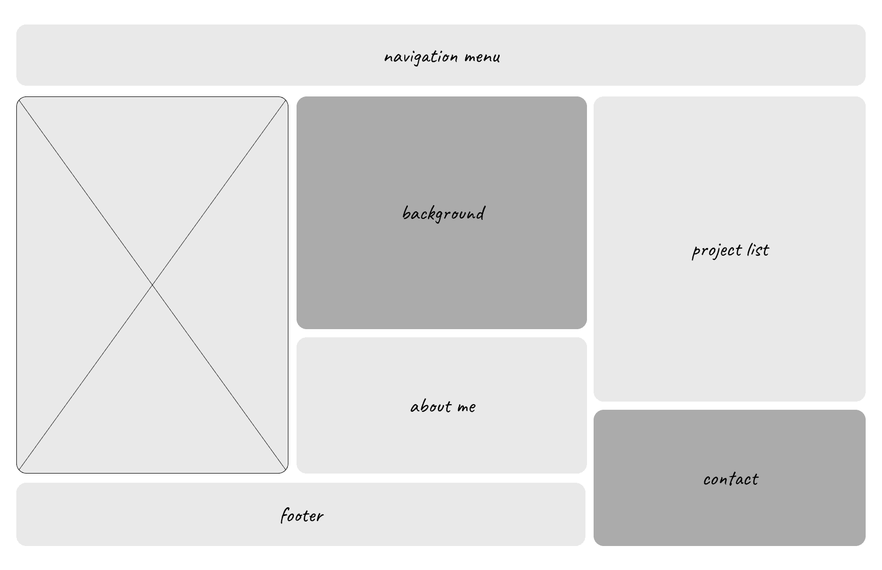
For content layout, I found that breaking up sections aids organisation and readability. The outline varies for desktop and mobile views and adapts to each page’s content. For example, the case study page centers on text with minimal images, so the layout includes generous spacing between paragraphs for readability.
Content Layout for About & Background pages
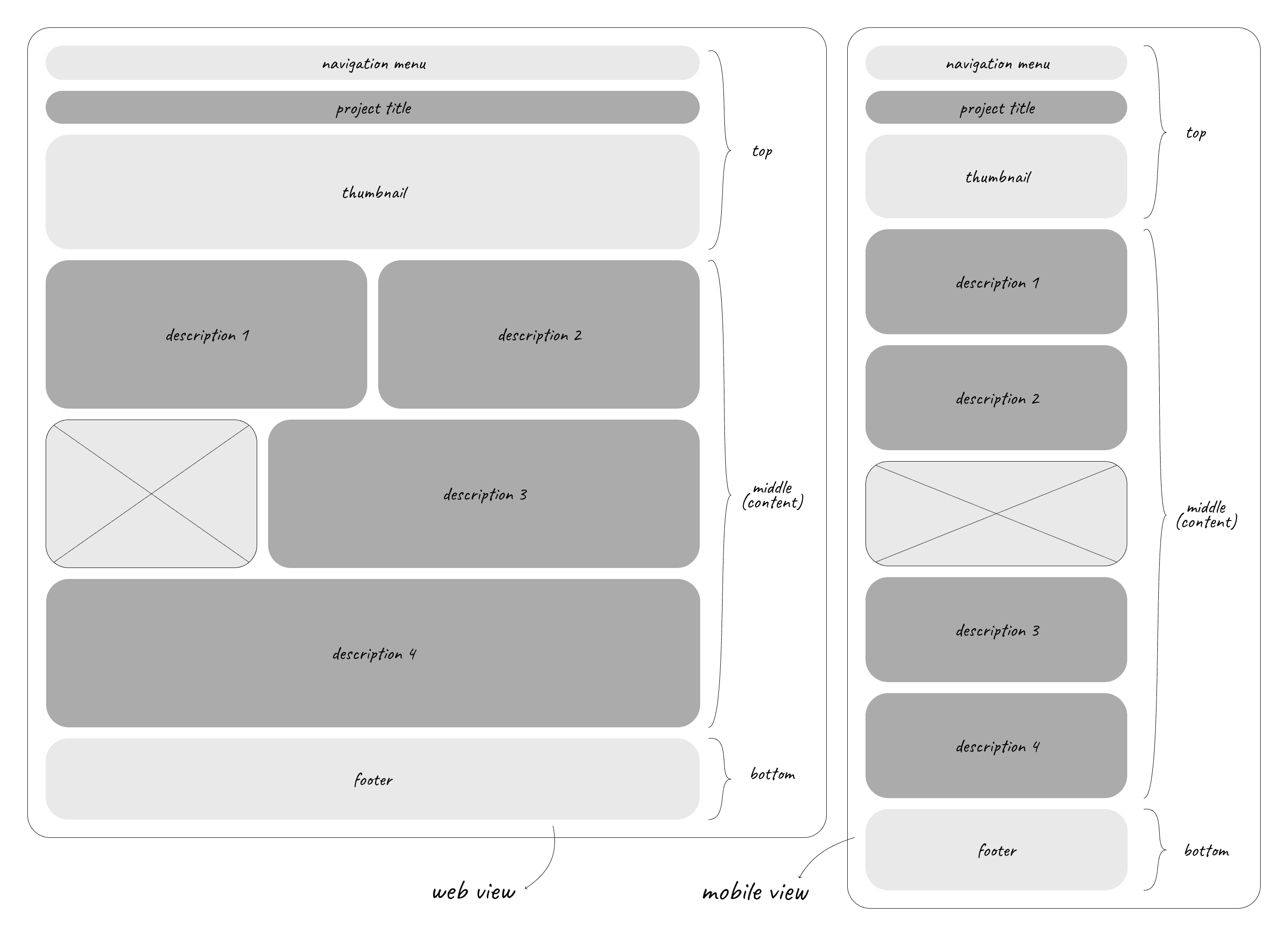
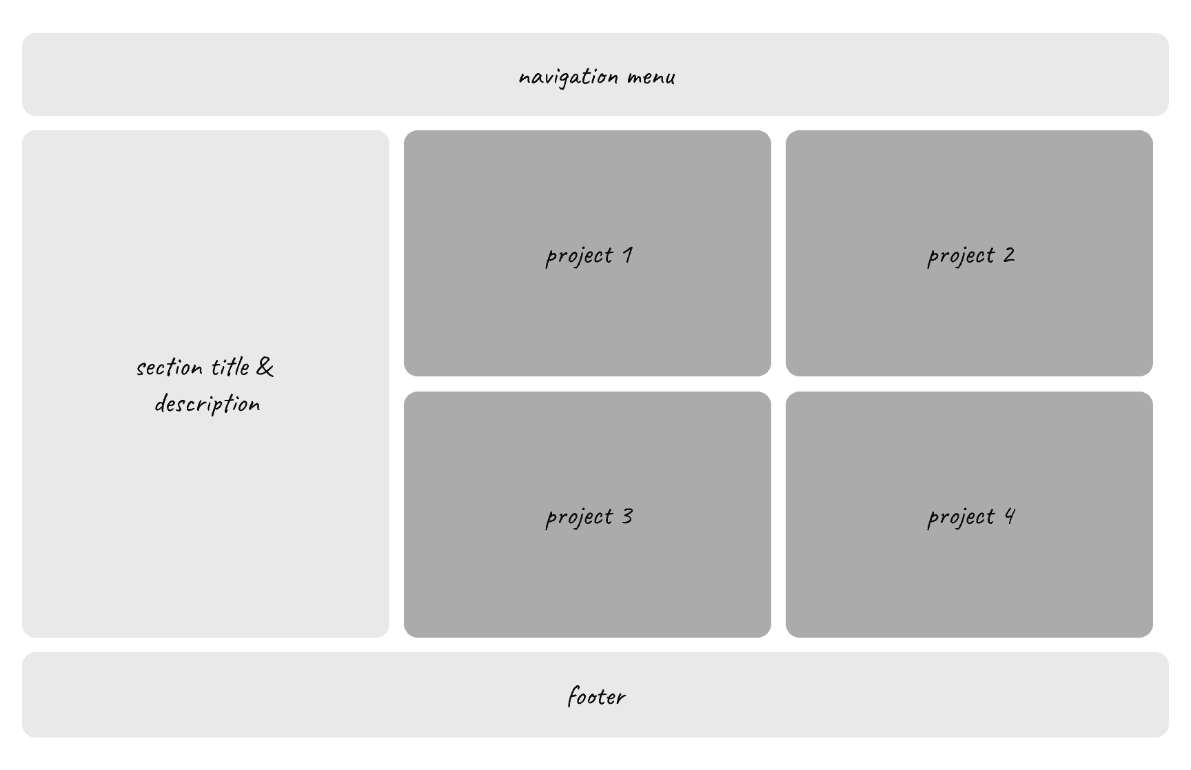
Content Layout for Case Study Pages
High-Fidelity Design
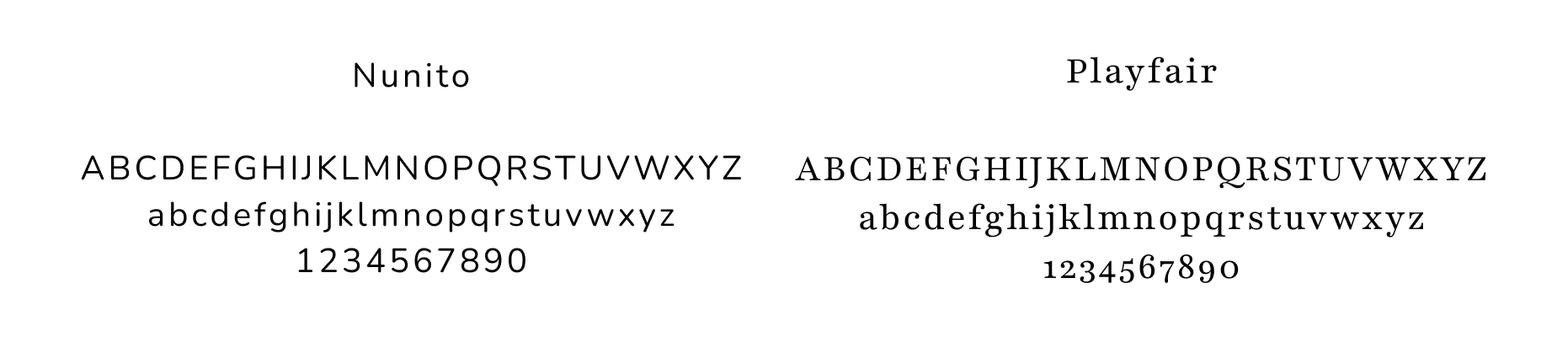
When it comes to ensuring readability and consistency in a portfolio, font choices and text styling are the key elements. Together, they set the tone and contribute to a cohesive, visually appealing design. Since I want my case studies to be easy on the eyes, a sans serif font with letter spacings and a16-pixel text size are the selections that I think provide just that. So I went through a few selections of fonts and found that Nunito, which I found both clean and cute, is the best to be used as a font to display the texts of my case studies. Another one that caught my eye is a serif font Playfair, a high-contrast serif with classic, elegant strokes that adds a lively touch in larger sizes or lighter weights. Thus, using it for the titles and headlines on other pages give them just the right touch of charm, giving a whimsical and inviting feel.
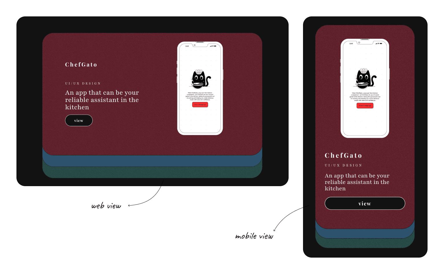
Prototype & Final Designs
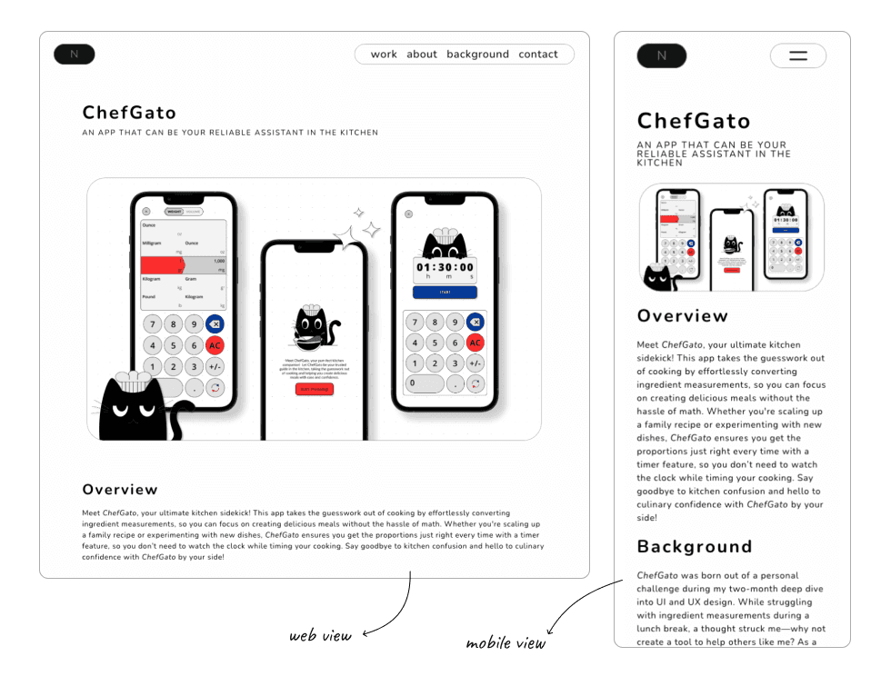
Web View & Mobile View of Case Study Page (ChefGato)
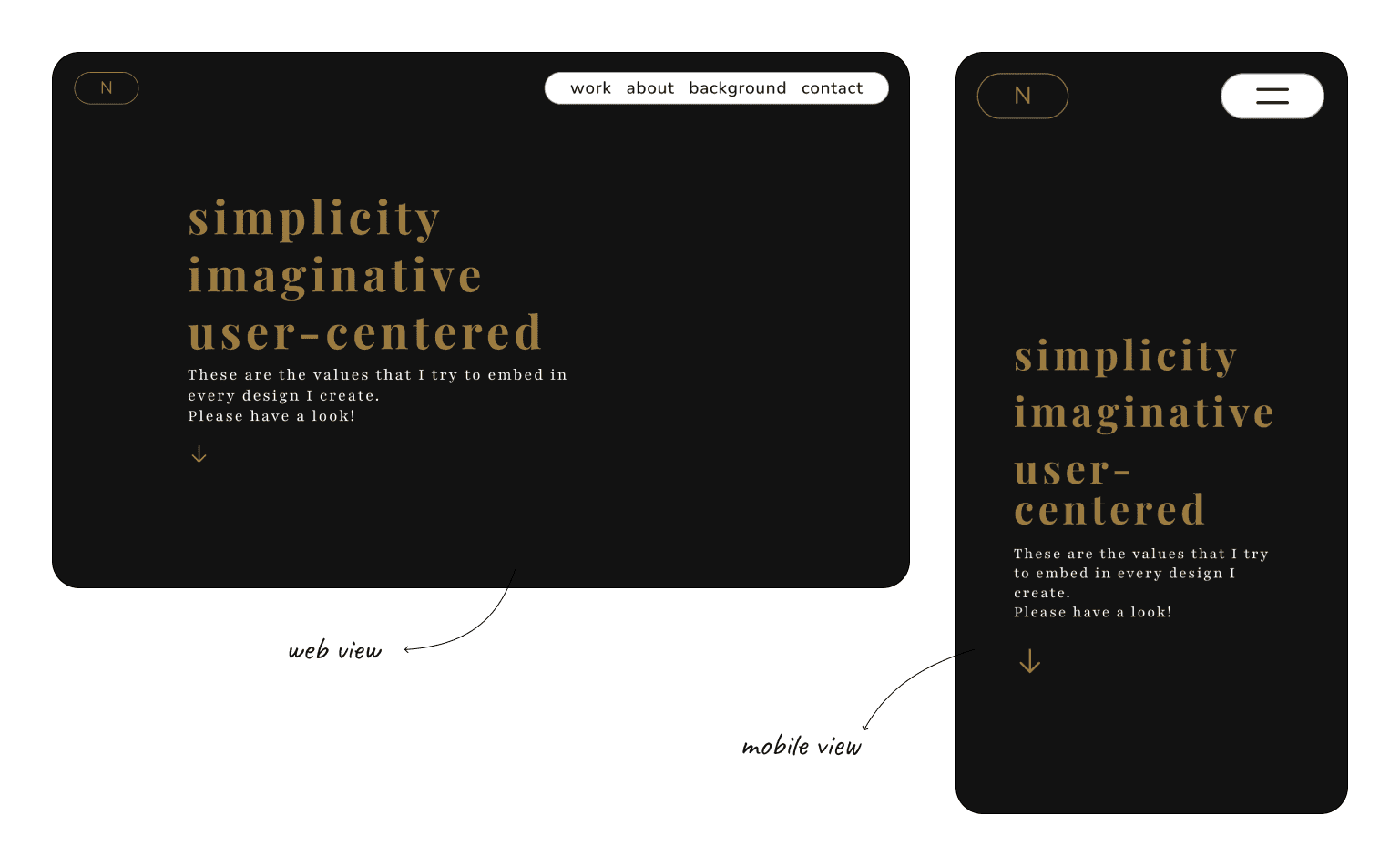
After completing the case study page, I moved on to designing the Background page. For this one, I aimed for a bold and modern look, fitting for a section dedicated to my academic background, work experience, and design philosophy. I chose a primary black background for its depth and used a dark shade of blue accent for the headline section, adding black and gold texts for an elegant contrast. Using my scallop pattern as a divider with parallax scrolling, I separated the headline from the content seamlessly. To keep this page dynamic, I animated the skill levels in the skills section, along with a fade effect for the academic timeline. Each section is further separated by scallop patterns, while a smooth scroll effect ensures a seamless experience for viewers to explore each part.
Next, I started designing the About page next. Since this is where visitors can get to know me personally, I wanted it to feel as “me” as possible. To create continuity, I mirrored the headline style from the Background page, using a dark purple accent with black and gold text. Similarly as well, I wanted to use one of the vector patterns created as the divider between the headline and content, but instead of the scallop patterns, I used my cloud pattern divider here, which adds a lighter, welcoming touch. To match that feeling, I placed vector illustrations on a primary white background, adding a soft animated effect to introduce a bit of movement for the content. Alongside my self-introduction, I also included a section on my personal values, styled in gold text on a black background with the scallop pattern divider, bringing an elegant touch to this part of the page.
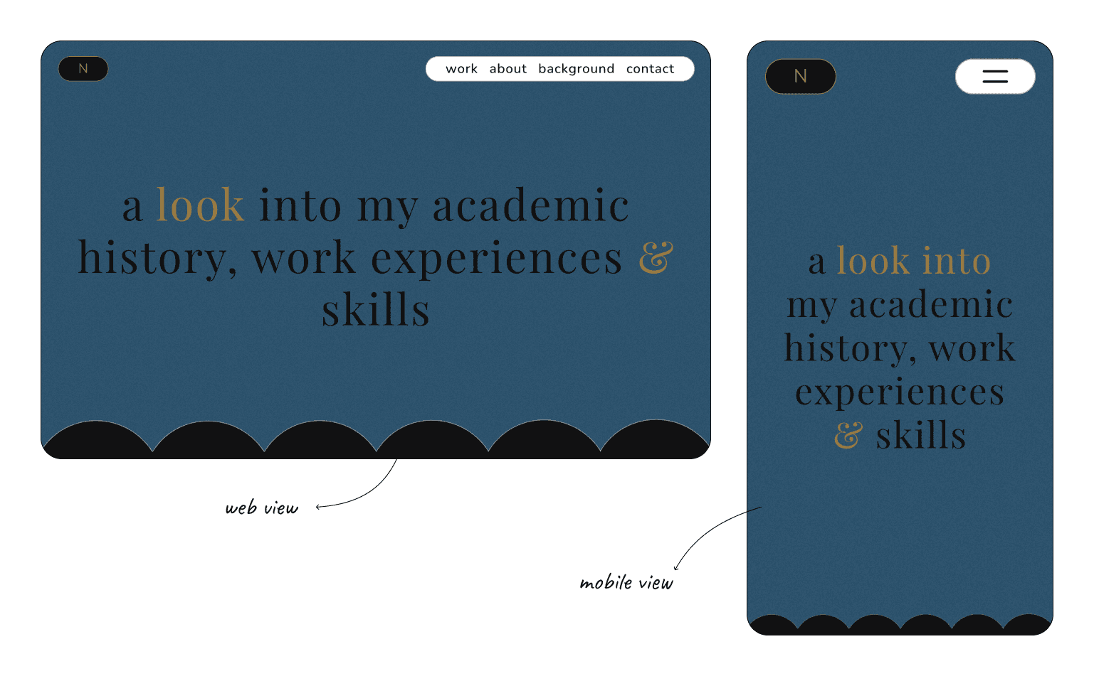
Web View & Mobile View of Background Page
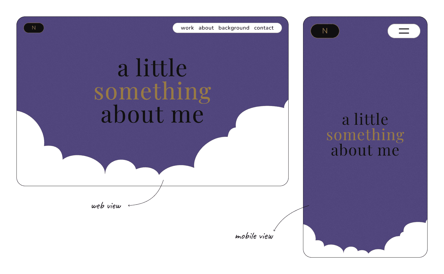
Web View & Mobile View of About Me Page
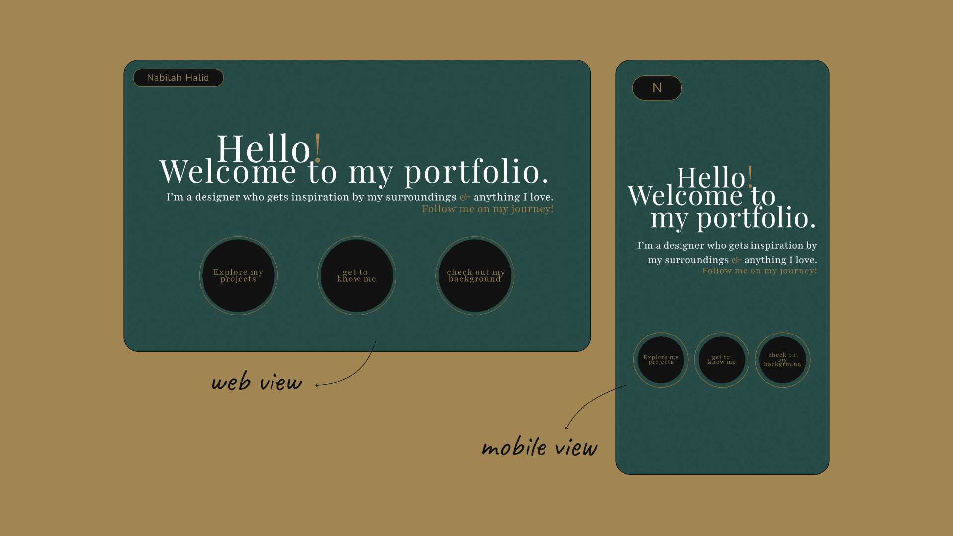
Web View & Mobile View of Work Page (headline)
Web View & Mobile View of Work Page (scrolled)
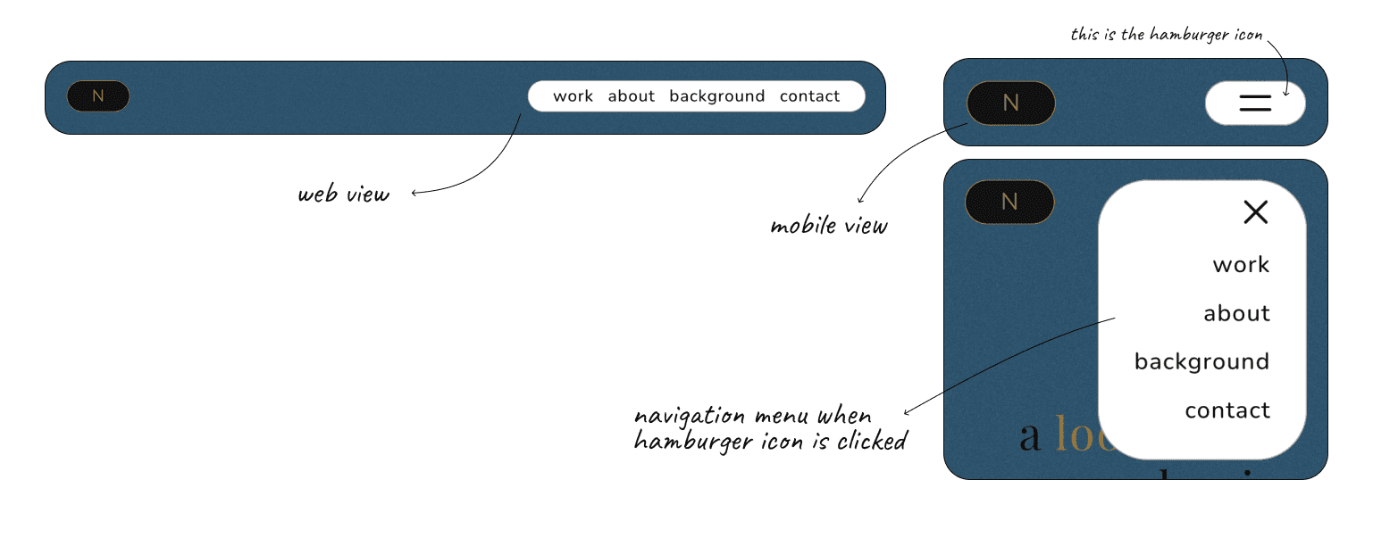
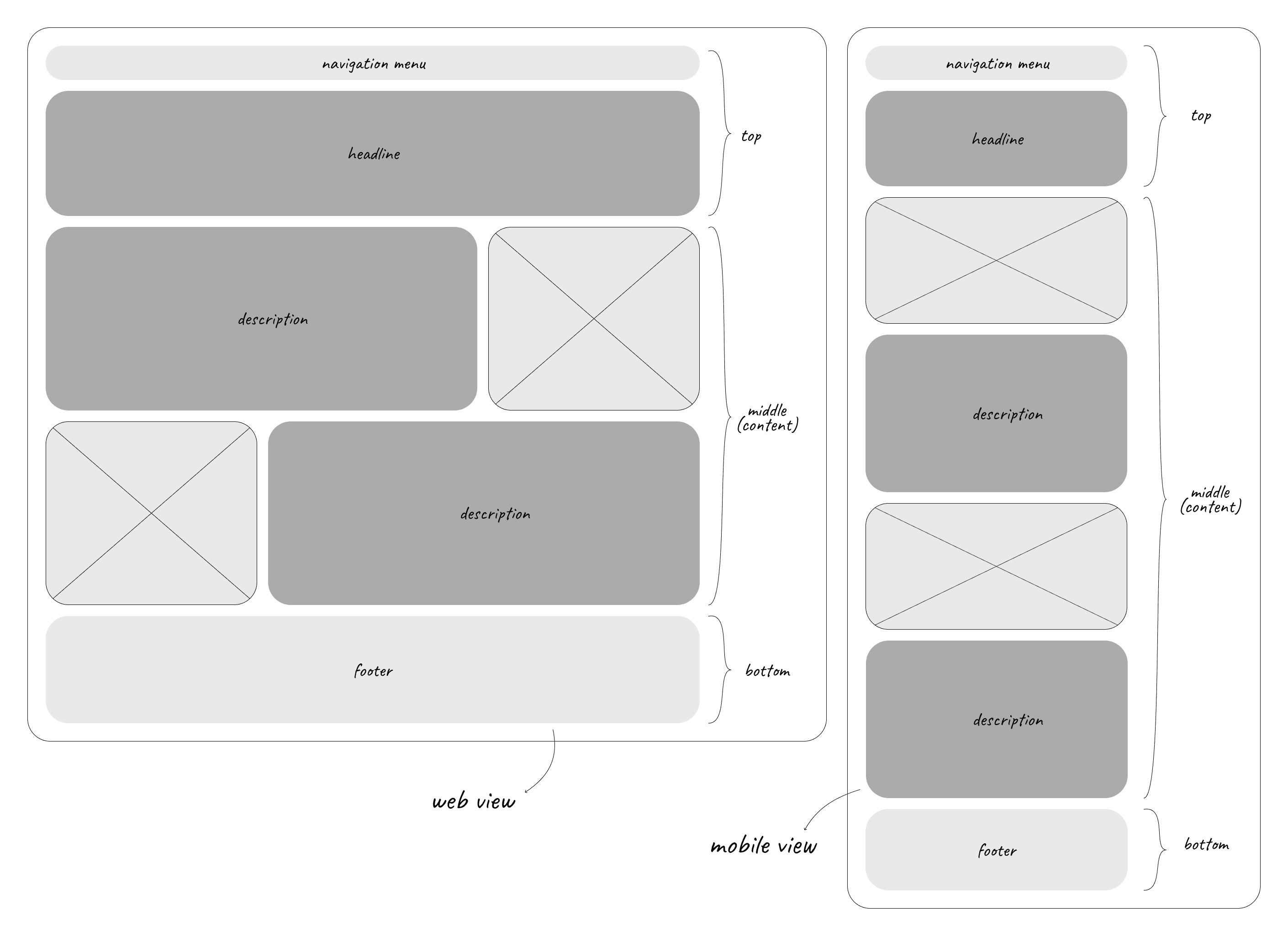
Web View & Mobile View of Navigation Menu (Background Page)
Future Improvements
Reflections
While working on this project, I genuinely enjoyed myself and made strides in discovering my own design style. This included researching diverse design styles and exploring the work of other designers for inspiration.
looking back
looking forward
I’m excited to keep refining my skills and expanding my toolkit. My next focus is on advanced interaction design and user testing to enhance engagement. I also want to delve deeper into responsive design, aiming for seamless experiences across devices. With each project, I’ll push myself creatively and technically, turning each challenge into an opportunity for growth.